This article is more than
3 year oldPepsi has unveiled a new logo for the first time in 15 years to celebrate the iconic brand’s 125th anniversary.
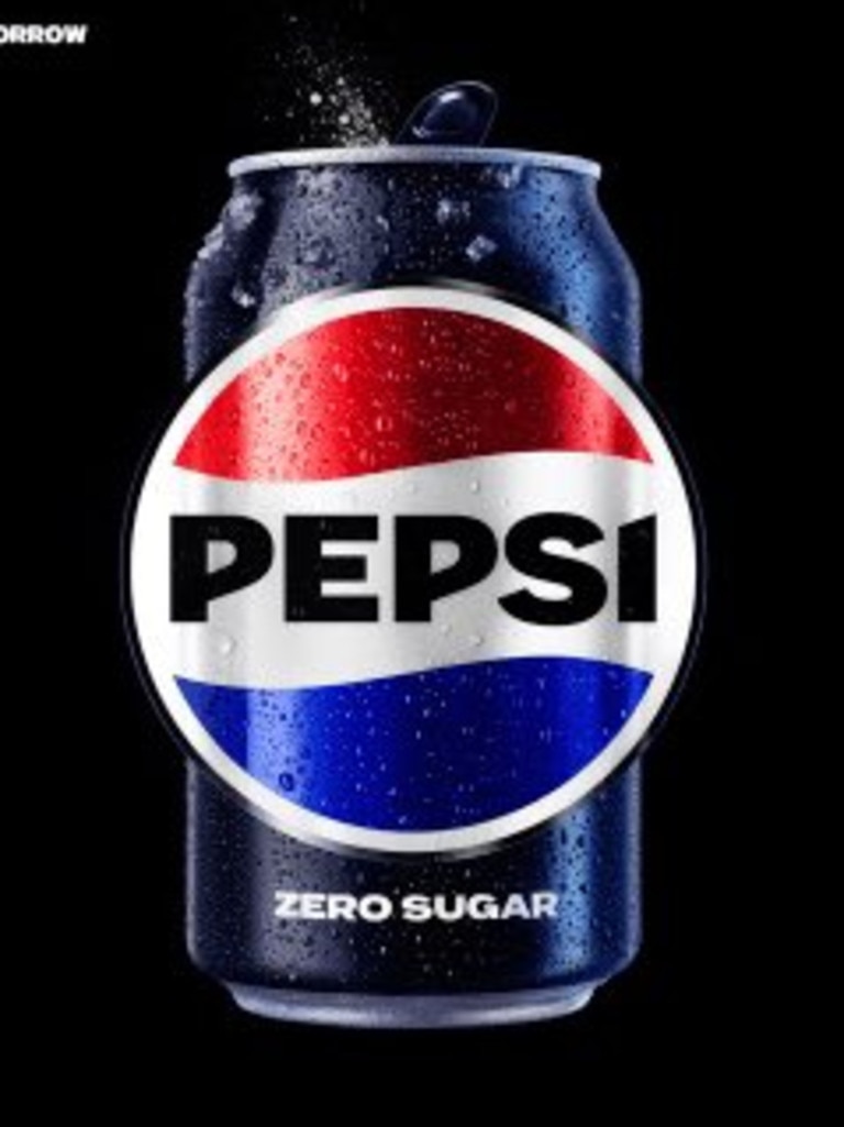
The new logo, which replaces one used since 2008, has the name “PEPSI” boldly centred in the middle of the famous red, white and blue striped circle.
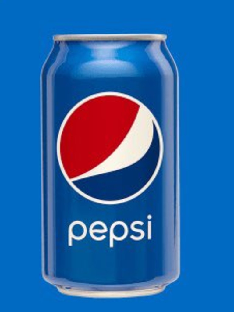
Previously, it had been written underneath in a lower case font that “doesn’t exude the confidence and energy that the brand really represents”, the soft drink company said.
The black-bordered circle has also changed. Instead of the coloured stripes being at an angle, they have returned to being horizontal, an original feature on the brand’s logo that was ditched back in 2007.
The new variation on Pepsi’s classic logo will be rolled out in the US and Canada later this year and will reach international shores, presumably including Australia, in 2024.
The goal in reimagining the logo was to infuse “great energy and confidence and boldness,” PepsiCo chief design officer Mauro Porcini told USA Today.
It comes after the business spent several years rethinking its branding and took on board feedback from focus groups who preferred the past logos with the word “Pepsi” inside a globe.
“So there was this implicit connection that we thought was not even out there today,” Pepsi chief marketing officer Todd Kaplan said in a statement.
“The challenge was: How can we take something that was part of our heritage and our past and project it to the present and the future?”
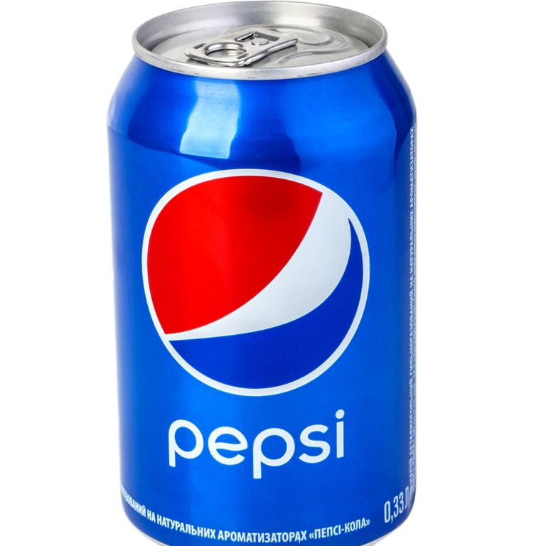
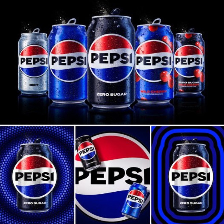
It’s not just the logo that is changing, with the brand’s iconic blue colour also getting a “contemporary” makeover, moving to a “richer electric” hue already used on Pepsi’s Zero Sugar cans.
Social media has been quick to comment on the new logo, with many praising Pepsi’s decision to go back to its roots.
“It’s retro and modern. They made the right call,” one wrote on Twitter.
“Pepsi with a Pep up that everyone can see,” another said.
“Love it tbh [to be honest],” a third wrote.
Others said they weren’t keen, arguing over which logo from years gone by they liked the most.