I'm a brand expert, here's why Google, Facebook and Twitter have blue logos
Have you ever wondered why certain colours are synonymous with specific brand logos and why we instantly recognise the blue bird?
No? Hmm...
Well, maybe you've noticed that some of the most recognisable logos in the world are all blue?
Think Facebook, LinkedIn, Skype and Telegram... to name a few.
*Nods slowly as you realise just how many damn logos are in fact, blue*
Well, turns out it’s all to do with ~psychology~. OOooOooOooO
Want to join the family? Sign up to our Kidspot newsletter for more stories like this.
The best-performing colours for business logos
New research by print company Solopress has revealed the best-performing colours for business logos within the food, drink, fashion, finance and tech industries as well as the psychology behind how colour can impact our purchasing decisions.
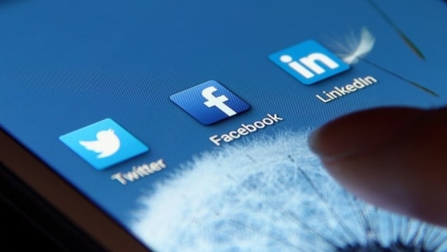
Black and blue dominate 53% of logos in the tech industry
The first interesting tidbit to come out of the study is that black and blue logos dominate the tech industry, accounting for 53% of the total best-performing brand logos in the world.
Blue, in particular, is often used for social media apps and is used by 30% of the best-performing tech companies.
But why's that, you ask? Surely they'd want to differentiate themselves, right?
Neuromarketing expert, Katie Hart explains, "Interestingly, the colour blue is now often associated with communication too, which may derive from these feelings of security and safety."
She then goes on to say that tiny changes to the exact shade of blue can make all the difference too.
"In fact, Google changed the specific shade of blue they use for their links when a search comes up to a more 'reddish' blue. Did you notice it had changed? No? Well, they attribute that change alone as contributing an additional $200m of advertising revenue per year. Per year! And most people didn’t even consciously notice that it had changed," she says.
Ironically, the colour blue also calms us down, reduces our impulsive tendencies and lowers our heart rate (all things I personally don't associate with social media apps, but hey everyone's different!)
Red and pink dominate food and drink
On the flip side, red and pink are the favourite colours of the food and drink industries, accounting for 41% of the food industry and 29% of the drink industry.
Hart comments, "Longer wavelength colours, like red, are known to have a stimulating effect on recipients. They arouse us and drive us into action. At some levels, red colours increase our appetite, heart rate and even blood pressure, making us act faster, be more impulsive and potentially eat more."
Can you see now why this is such a popular colour to use in the food and drink industries, particularly fast food chains?
Nom, nom, nom...
Neuromarketing and colour psychology affects the way we think and behave
As you can see, all this behind-the-scenes neuromarketing and colour psychology really does have a significant impact on the way we behave, communicate, think, feel and consume.
Ultimately, it also affects our purchasing habits too.
And perhaps the scariest part is, colour affects us subconsciously, according to Hart, meaning we're not truly aware of the power it has over us. We have no control over it whatsoever.
Food for thought...

<p>After sparking fears among fans by posting a series of crying photos, Justin Bieber has taken to social media with a huge announcement.</p>
Kendrick Lamar Beat Drake By Being Drake
How Kendrick Lamar and Drake changed rap beefs forever Rapid-fire releases and fast pace of modern life elevate diss war to levels unparalleled in hip-hop history.
UN assembly urges Palestine membership after vote
Taylor Swift concert photo horrifies internet
Island nation erupts into violence, three dead
Sean 'Diddy' Combs asks judge to reject lawsuit alleging rape of 17-year-old girl in 2003
Ukraine finds itself in a grave situation. Russia appears to be advancing
Ellen to make TV comeback after two years
How the West's plan to punish Russian oil backfired